I’ve seen too many tech companies treat graphic designers like they’re just there to make logos look pretty.
You’re probably thinking a designer handles your branding and maybe throws together some social media posts. That’s barely scratching the surface of what they can do for your business.
Here’s the reality: a skilled graphic designer creates assets that touch every part of your tech company. Marketing materials. Product interfaces. Sales collateral. Internal documentation. The list goes on.
Most tech firms miss out on half the value because they don’t know what to ask for.
I analyzed how successful tech companies use design across their operations. Not just the flashy stuff you see on their Everything behind the scenes that actually moves the needle.
This article maps out what a graphic designer can make for your tech business. I’ll break down the categories so you know exactly which assets you should be requesting and why they matter.
We’re talking about real deliverables that impact your bottom line. Not theory.
You’ll get a clear picture of the full scope of design work available to you. Consider it a checklist for making sure you’re actually using your creative resources the right way.
No fluff about the power of good design. Just the specific products and assets you should expect from someone who knows what they’re doing.
Foundational Branding: Building the Visual Operating System
Most people think branding is just picking colors and slapping a logo on things.
They’re wrong.
I see companies dump thousands into flashy websites and social media campaigns before they even nail down their visual foundation. Then they wonder why everything feels disconnected.
Here’s the contrarian truth: your brand style guide matters more than your marketing budget.
Yeah, I said it.
You can have the best product in the world, but if your visual identity is all over the place, people won’t trust you. (And trust is what separates companies that grow from companies that disappear.)
Your logo isn’t just a pretty picture. It’s the anchor for everything else. You need the core mark, sure. But you also need variations that work everywhere, from a tiny app icon to a billboard.
Most designers will tell you to keep it simple. I agree, but not for the reason they give.
Simple doesn’t mean boring. It means your logo works at any size without falling apart.
The brand style guide is where most companies fail. They create one, stick it in a folder, and never look at it again. What a waste.
A real style guide defines your typography choices, your color system (primary, secondary, accent), and how icons should look. It tells anyone who touches your brand exactly what to do.
When what a graphic designer can make gfxtek covers tech branding, this is the foundation I’m talking about.
Business collateral comes next. Digital and print templates for business cards, letterheads, email signatures. The stuff people actually see when they work with you.
Skip this step and you’ll have team members creating their own versions. Suddenly your brand looks like five different companies.
Presentation templates save you more time than you think. PowerPoint, Google Slides, Word docs, reports. Template them once, use them forever. By utilizing presentation templates like those offered by Gfxtek, you can streamline your workflow across various platforms, allowing you to focus more on your gaming content and less on repetitive formatting tasks.
Some people say templates limit creativity. Wrong again.
Templates free you up to focus on the content instead of reinventing the wheel every time you need to pitch something.
Your visual operating system isn’t sexy. It won’t go viral on social media.
But it’s the difference between looking like a professional operation and looking like you’re making it up as you go.
Marketing & Sales Enablement: Assets that Convert
You need assets that actually work.
Not just pretty designs that sit in a folder somewhere. I’m talking about the stuff that gets clicks, generates leads, and moves people through your funnel.
Here’s what I’ve learned after years in this space. The assets that convert aren’t always the ones you’d expect.
Digital advertising creatives are your front line. Banners, social media ads for LinkedIn, Twitter, and Instagram. Display ads that look good on mobile and desktop. You’ll want versions for A/B testing because honestly? I can’t always predict what’ll perform better. Sometimes the simple version wins. Sometimes it’s the one with more detail.
Content marketing visuals make complex topics digestible. Infographics break down tech concepts that would take three paragraphs to explain. Cover images for your blog posts and articles. Custom charts and graphs when you’re presenting data (because stock charts look like stock charts).
Then there’s your social media graphics. Templates for announcements, quotes, tutorials, and campaign content. This keeps your feed active without starting from scratch every single time.
Lead generation assets need to look professional. eBooks, whitepapers, case studies, checklists. People are giving you their email address. The design needs to feel worth it. I explore the practical side of this in Gfxtek Tech Software Guide by Gfxmaker.
And email marketing templates that actually render correctly. Newsletters, product announcements, promotional campaigns. They need to be responsive because half your list is reading on their phone.
Look, I’ll be straight with you. I don’t know which specific asset type will work best for your business. It depends on your audience and where they spend time. What I do know is that graphic design with ai gfxtek can help you create these faster than traditional methods.
The real question isn’t what assets you need. It’s which ones you’ll actually use.
Product & User Experience: Designing the Interface
You can have the best product idea in the world.
But if it looks like garbage? Nobody’s using it.
I see this all the time. Founders spend months building features and then slap together some interface at the last minute. They wonder why users bounce after thirty seconds.
Here’s what actually matters when you’re designing an interface.
UI/UX Visual Elements
This is where things get real. A graphic designer builds the visual layer that sits on top of your UX architecture. We’re talking custom icon sets that make sense at a glance. Buttons that people actually want to click. Form styles that don’t make users want to throw their phone across the room.
Some people say you should just use templates and move on. Why waste time on custom visuals when there are thousands of UI kits out there?
Fair point. Templates are faster and cheaper.
But here’s the problem. Your app ends up looking like every other app in your category. Users can’t tell you apart from your competitors. That’s not where you want to be.
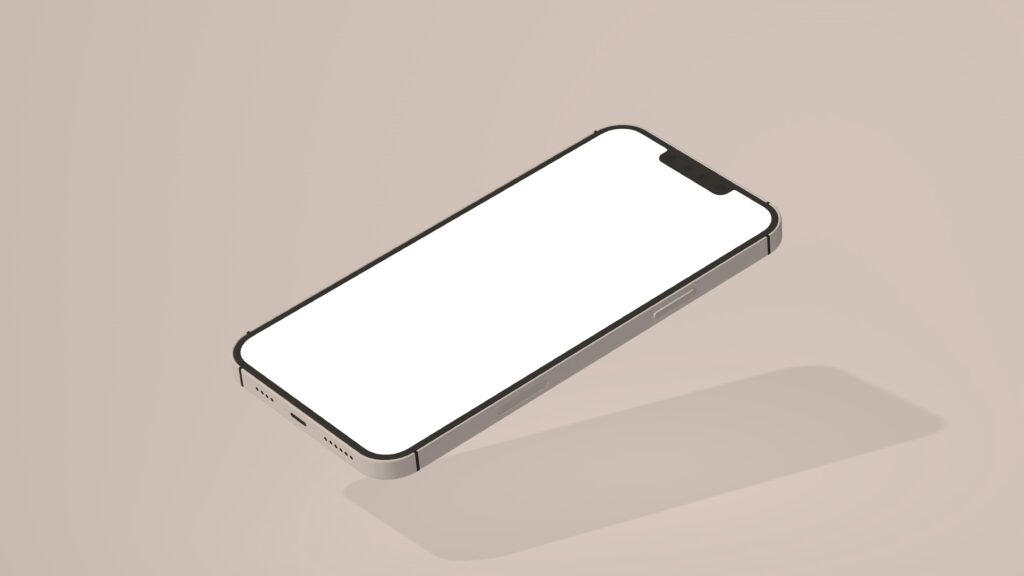
App Store & Marketplace Graphics
Your app icon is the first thing people see. If it doesn’t pop, they scroll right past you.
I’m talking about compelling visuals for the Apple App Store and Google Play Store. Screenshots that show your best features. Promotional banners that make people stop and look. To truly captivate potential players in the Apple App Store and Google Play Store, leveraging cutting-edge design tools like Gfxtek can elevate your promotional banners and screenshots to showcase your game’s most enticing features.
This stuff isn’t optional anymore. The marketplaces are crowded and you’ve got maybe two seconds to grab attention.
In-App Graphics & Illustrations
Think about the last time you opened a new app. What made you stick around?
Probably some combination of clear onboarding and visuals that didn’t suck. Maybe some illustrations that walked you through features. Empty state graphics that were actually helpful instead of just saying “nothing here yet.”
These little touches matter more than you’d think. They’re the difference between someone finishing setup and someone deleting your app halfway through. I walk through this step by step in Gfxtek Graphics Design Guide From Gfxmaker.
Website & Landing Page Design
Your website needs to do one thing well. Guide people toward action.
That means high-fidelity mockups for your homepage that communicate value in five seconds or less. Feature pages that explain what you do without making people read a novel. Pricing pages that don’t confuse the hell out of everyone.
What a graphic designer can make at GFX Tek is the difference between a site that converts and one that just sits there looking pretty.
Here’s my recommendation. Don’t cheap out on interface design. But don’t overspend either.
Start with your core screens. Get those right first. Make sure your app store presence is solid because that’s your first impression. Then layer in the nice-to-haves like custom illustrations and animations.
And whatever you do, test everything with real users before you launch. What looks good to you might be completely confusing to someone seeing it for the first time.
Events & Internal Communications: Unifying the Culture
Some designers think event materials are just decoration.
They’re wrong.
When you walk into a trade show, you’ve got maybe three seconds to make someone stop. Your booth backdrop either pulls them in or they keep walking.
I’ve seen companies drop thousands on booth space and then slap together some generic banner. It doesn’t work.
Your event materials are your first impression. And yeah, that includes everything from your conference flyers to the stickers you hand out.
Now here’s where people push back. They say branded merchandise is a waste of money. Just corporate junk that ends up in a drawer somewhere.
Fair point. Most swag is forgettable.
But when you design t-shirts and hoodies that people actually want to wear? That’s different. I’ve watched employees choose to wear company gear on weekends because the design was actually good (not just a logo slapped on cheap fabric).
The same goes for internal communications. You might think your team doesn’t care about how your company announcements look. But what a graphic designer can make gfxtek is the difference between people reading your message or ignoring it.
Graphics for internal newsletters and training materials do more than look pretty. They reinforce who you are as a company.
When your presentation visuals at conferences match the notebooks on your employees’ desks, you’re building something real. A culture people can see and feel. By integrating cohesive visuals through Graphic Design with Ai Gfxtek, companies can create a powerful and immersive culture that resonates not just in the conference room but throughout every workspace.
Not just another corporate identity that exists in a brand guide nobody reads.
Design as a Strategic Growth Engine
We’ve covered the full spectrum of design deliverables here.
From core branding to product UI to marketing assets, you now see what’s possible when you treat design as more than just making things look good.
What a graphic designer can make gfxtek depends on how you position the role. If you see design as an isolated task, you’ll get isolated results. But when you view it as an integrated function, something shifts.
Brand cohesion improves. Growth opportunities appear where you didn’t see them before.
You came here to understand what designers actually deliver. Now you have that clarity.
Here’s your next move: Audit your current design assets against this list. Look for gaps. Find places where better design could move the needle on your business goals.
The companies that win aren’t always the ones with the best product. They’re often the ones that communicate their value most clearly.
That’s where design comes in (and why it matters more than most people think).
Take stock of what you have. Figure out what’s missing. Then decide how you’re going to close that gap.
 Tylorin Xenvale has opinions about emerging technology trends. Informed ones, backed by real experience — but opinions nonetheless, and they doesn't try to disguise them as neutral observation. They thinks a lot of what gets written about Emerging Technology Trends, Expert Analysis, Practical Tech Tutorials is either too cautious to be useful or too confident to be credible, and they's work tends to sit deliberately in the space between those two failure modes.
Reading Tylorin's pieces, you get the sense of someone who has thought about this stuff seriously and arrived at actual conclusions — not just collected a range of perspectives and declined to pick one. That can be uncomfortable when they lands on something you disagree with. It's also why the writing is worth engaging with. Tylorin isn't interested in telling people what they want to hear. They is interested in telling them what they actually thinks, with enough reasoning behind it that you can push back if you want to. That kind of intellectual honesty is rarer than it should be.
What Tylorin is best at is the moment when a familiar topic reveals something unexpected — when the conventional wisdom turns out to be slightly off, or when a small shift in framing changes everything. They finds those moments consistently, which is why they's work tends to generate real discussion rather than just passive agreement.
Tylorin Xenvale has opinions about emerging technology trends. Informed ones, backed by real experience — but opinions nonetheless, and they doesn't try to disguise them as neutral observation. They thinks a lot of what gets written about Emerging Technology Trends, Expert Analysis, Practical Tech Tutorials is either too cautious to be useful or too confident to be credible, and they's work tends to sit deliberately in the space between those two failure modes.
Reading Tylorin's pieces, you get the sense of someone who has thought about this stuff seriously and arrived at actual conclusions — not just collected a range of perspectives and declined to pick one. That can be uncomfortable when they lands on something you disagree with. It's also why the writing is worth engaging with. Tylorin isn't interested in telling people what they want to hear. They is interested in telling them what they actually thinks, with enough reasoning behind it that you can push back if you want to. That kind of intellectual honesty is rarer than it should be.
What Tylorin is best at is the moment when a familiar topic reveals something unexpected — when the conventional wisdom turns out to be slightly off, or when a small shift in framing changes everything. They finds those moments consistently, which is why they's work tends to generate real discussion rather than just passive agreement.